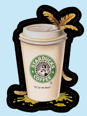
10. Starducks Coffee

- March 2005
- Starbucks Coffee
- John Marshall/ Jeff Zapata
- Luis Diaz
Art Stages
 Rough Concept Drawing(s)
Gag writer John Marshall first proposed "Starclucks" for this parody. The circular logo was to contain a chicken rather than a duck, and Marshall's original tag line was "Fowl-tasting." The notes found on two nearly-identical copies of Jeff Zapata's "Starducks" rough sketch contain alternate, unused jokes. On one copy of the rough sketch (A), following the suggestion that the tag line "It's for the birds" might be used, the phrase "Malard Flavor" is listed as another option. This line is not present on the other rough copy, however. On the other copy (B), two notes can be seen that are not on sketch (A): "Daffinated" is written near the bottom of the cup, and a marginal note reads "Make the duck logo more graphic like the Starbucks one." |
  Preliminary Logo Preliminary Logo
Luis Diaz created this "Starducks" logo in PhotoShop. The "R" in the ® symbol found on the actual Starbucks logo has been replaced by a "W" for "Wacky." |
 Final Painting Final Painting
Diaz's final painting is a faithful rendition of the rough concept. The black outline around the cup is narrower in places on the art than on the printed sticker; the outline was apparently widened during the production process to allow more leeway for the sticker die-cut. The Topps Vault sold the finished art for "Starducks" for $3160.66 in an eBay auction which ran from September 29 - October 6, 2005. |
Printed Sticker

 Card Front & Back
The Middle Left (ML) piece of the "Bling Dings" puzzle is found on the back of "Starducks." |
Connections
 Unused ANS2 Concept:
 "Upchucks Coffee" David Gross's parody of Starbucks House Blend coffee was not accepted for development into a final painting. |